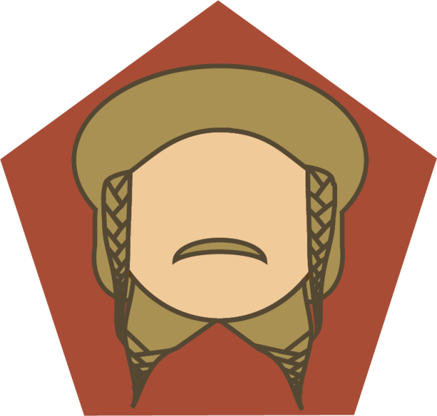
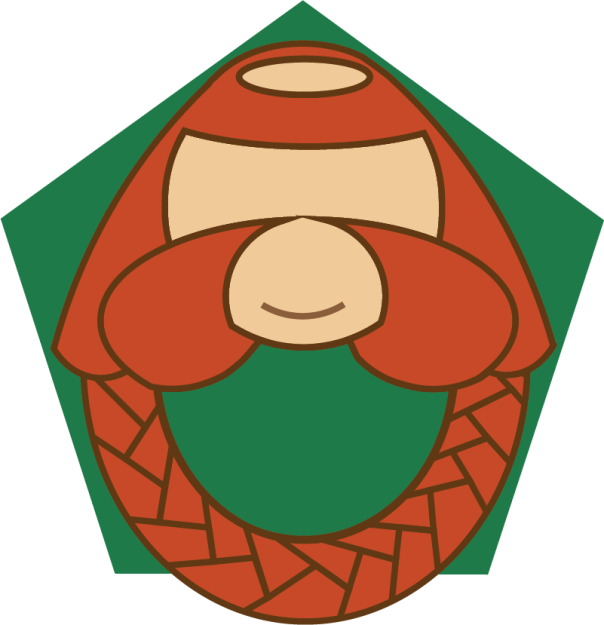
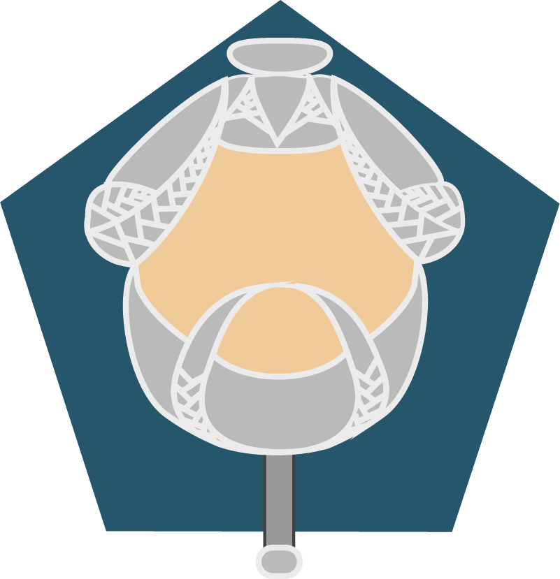
Icon Set Assignment
Overview
For the past two weeks I have been learning how to use Adobe Illustrator for my Visual Communications class. The assignment was to make a set of icons that each conveyed a single message while still remaining visually in sync. They all had to be different images styled in the same way so that it is easy to know they belong together.
Creation Process
I initially had a hard time deciding what I was going to do for an icon set. I had two options I was interested in trying. Something for children or something for nerds. I chose these two audience groups because they are what I am most familiar with. I have two kids and my husband and I are total nerds. If I was to go with the kid’s icons, I wanted to make something educational based and maybe designed as an app icon. For the nerd route I knew I wanted to make character illustrations. I always love seeing fan art on sites like Tumblr and Pinterest. There were so many options going through my mind so I made several quick sketches.
![]()
I then came up with a few color pallets. The first was bright and eye catching so that kids can be instantly drawn to it. The next two were simple pallets so as not to distract from the character representations. Basic black and white with a red accent and then some earthy jewel tones.


I decided to try my hand at fan art and create some character icons. I chose to use some members of the dwarven company from The Hobbit. Specifically Nori, Dori, Ori, and Bombur. The guys I circled in this photo.

First Draft
I am a HUGE fan of anything Tolkien and Middle Earth and I thought these four characters would be so much fun to illustrate. This was my first draft. All of this was accomplished using the pen and shape builder tools.
![]()
I didn’t receive very much feedback from my classmates. The only suggestion made was that Ori’s head looked pretty wide compared to the others. I also got feedback from my sister. She said that Bombur needed a double chin if I wanted to make a true character representation. All the other changes I made were based on feedback given to my classmates’ projects. I noticed that a lot of people were saying that icons needed uniform backgrounds. I originally had solid jewel toned background colors. The only thing uniform about them were the fact that they were jewel tones. I decided to use a geometric shape to bring more unity as well as add more representation of dwarven culture which uses geometric shapes in its decor. I also switch the background colors of Dori and Nori. I felt Dori’s light hair would go better with a darker background. Nori’s haircolor also went better with a lighter background color.
Final Draft
This is the final result!
![]()
While each character is unique, these icons work together as a set because of my illustration style. A simple character representation made of solid shapes, colors, and bold lines. All brought together with a familiar background. I very much enjoyed this assignment and am so excited to have gained a new art skill. If you would like to look at each icon in greater detail, keep on scrolling! If you have any comments or would like to provide a critique, please do! I am always looking to improve.


