
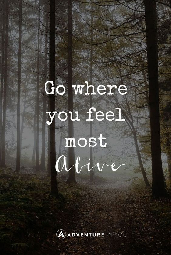
I found this gorgeous image on an online travel resource site called Adventure In You. Ana Faustino, wrote an article with a list of quotes that are meant to inspire adventure in the hearts of her readers. While there were many great quotes, this one was my absolute favorite. I found the whole design to be very appealing in the simplicity of the quote and in the contrast of the fonts used. Here I will break down the typography and explain its importance in design.
Contrasting Fonts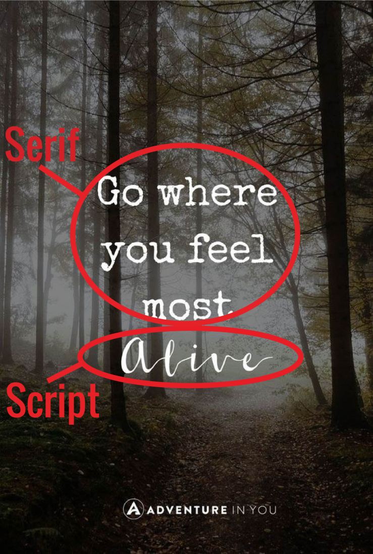
There are two distinct fonts being used in this graphic. The contrast between the two is what brings the eye through the quote and clearly displays the emphasis on the most important word in the text. “Alive” is the word set apart from the rest in a beautiful script, compared to everything else being in a grungy serif. A simple typeface is best used in the bulk of a text. Only use a decorative and contrasting font to highlight key words.
Slab Serif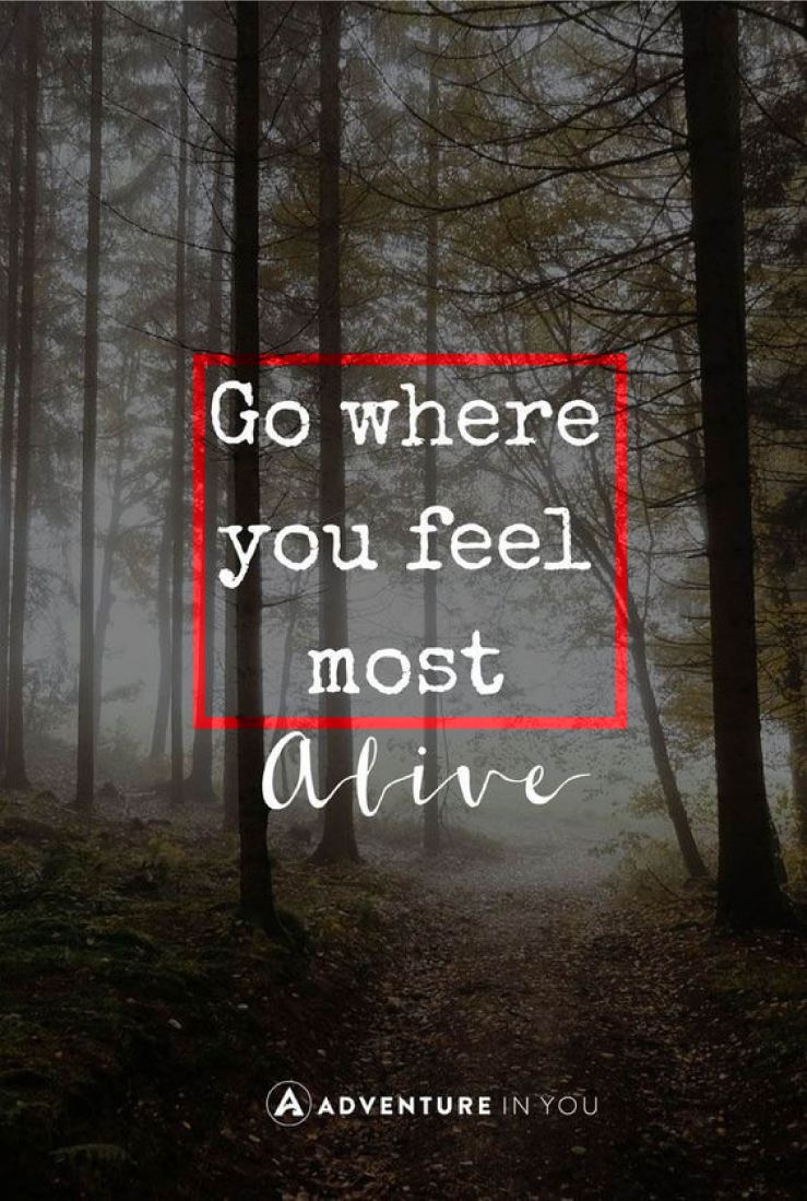
The bulk of the quote it in a serif typeface, meaning it has little decorative feet projecting from each letter. As a slab, it has little to no thick/thin transitions in the stroke of the letter. This particular font is reminiscent of an old typewriter’s print. It plays into the roughness of the outdoors with its rugged look.
Script
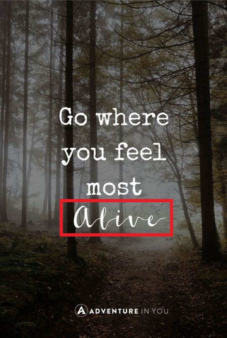
I love how the word ‘Alive’ is highlighted by a script typeface. It really emphasizes the beauty of the freedom that outdoor activities provide. Exactly what that word implies on its own. Scripts are meant to appear handwritten and in this case with ink. This contrasts with the stamped style of the first typeface. The thick/thin transition in the strokes of each letter as well as the connecting strokes provides the look of a steady flow of ink but also the natural state of free-handed styling.
Beautiful, Short, and Sweet
The style of this graphic is perfect for the message being sent. The meaning is displayed in more than just the words. A good design also conveys meaning with typography. Much like the brush strokes of a painting. The rugged nature of the outdoors and the freedom of adventure is clearly demonstrated in each typeface. Combined with the woodsy background and the quote itself, the image makes for a very convincing ad for outdoorsmanship. Overall, it’s the simplicity of the piece that has inspired me to take a step outside. A short quote and only two contrasting fonts can be all that’s needed for a good typographic design.
