Analysis and Replication

Slide Design/ Presentation

I have been working on designing a slide presentation for creating an ad. My goal was to create a mock presentation for an employer. I was to analyze an an existing ad and then use the same design aspects to create a new ad for the campaign. I chose to use something from Coca-Cola and the Olympics.

Original Ad

I chose this specific ad from the 2012 Summer Olympics because I was really impressed with the use of the Coke logo as the ribbon for the rhythmic gymnastics. I also really liked how they used the brand colors throughout the entire image. Using the athlete to represent the Olympics and then the ribbon and background to represent Coke. I found this ad here.

My Ad

I chose to use a sport that was also in the same Olympic season as the rhythmic gymnast, but I didn’t want something that was too obvious. I went with Kayaking since it’s not usually the first thing people think of when it comes to the Summer Olympics.

How it’s Made

I used three programs in this project. I have spent the last few months learning how to use each of these programs and I am so happy to finally be able to use them all in the same piece. I used Adobe Illustrator, Photoshop, and InDesign.

  • Illustrator:

    • I used this to create the silhouette image of the kayaker. I grabbed a stock photo and used the curvature tool to trace around the image and make custom shapes for his body, clothing, and kayak gear.
  • Photoshop:

    • This was used to put together the kayaker, background, logos, and Coke Swish.
  • InDesign:

    • I made a slide presentation that shows my full analysis of the original ad and how I used it to create my addition to the campaign.

The Final Product

I used a screen capture program to record my presentation. Take a look!

I am really happy with how my ad turned out. This is one of the coolest things I have made so far. I think it’s pretty tied with my icon project. I also think I should take a public speaking course. I was so uncomfortable with recording my presentation. I want to be able to get over that so I can be FEARLESS!


Advertising Attempt

And The Winner Is…

This most recent project was to create an advert for an everyday product. I used a random generator to find a target audience and product. Here are the results.

  • Product: Pencil
  • Brand: Ticonderoga
  • Gender: Male
  • Age: 45-54
  • Relationship: Married
  • Education: Associates
  • Income: $15,000- $39,000
  • Media Consumption: Magazines and Social Media

Brain Storming

I figured that a man in that age bracket might not be satisfied with an associates degree or maybe never had a chance to further his education. He could be dissatisfied with his current job or maybe is looking to increase his income. Pencils are pretty mundane and people don’t usually think of them as something special. However, everyone uses pencils or pens all the time. They use them for work and school and everything in between. With that being said. It would be ideal to make an advertisement appealing to improve life situations by focusing on the tool that is used to make it all happen. This phrase was constantly coming to mind as I was making my sketches. “By small and simple things are great things brought to pass” (Alma 37:6 from the Book of Mormon)

Sketches

I made each of these quick sketches on my phone so they aren’t the most beautiful drawings.

Contestant #1

A puppet whose strings are being sliced by a pencil. I imagined someone being stuck in a low paying corporate job. I was planning on making the average business man as the puppet, advertising the pencil as a tool for freedom be it self-employment or a promotion.

Contestant #2

This next sketch depicts a man holding the keys to a new sports car. A pencil is drawing the car meaning it is the source of this good fortune. By using the quote, “life is what you make it” my goal was to put the power of fortune in the hands of the audience by way of my product.

Contestant #3

This sketch was to inspire the audience to gain a higher education to hopefully improve their quality of life or work. I felt this was the way to go since pencils are essentially a symbol of education. I decided this was going to be my ad.

First Draft

I was pretty satisfied with my first draft aside from the obviously horrible text. The only problem I had I couldn’t really put my thumb on it. Thankfully, I had a couple of great peer reviews that pointed out what needed fixing. My biggest design fails were that the brick background was too busy and distracting and my dream bubble needed better placement.

Final Drafts

I fixed the two main problems and chose better fonts for my text. Since my audience mainly spent time on social media and reading magazines for their media consumption, I created a one page magazine ad and a small Facebook ad. Since the ad for Facebook was rather small I decided to simplify my message to make it more clear and to the point.

Final thoughts

I had a really hard time with this assignment. While I am fairly creative when it comes to art and design, I found out that I am not metaphorically creative. These ads were supposed to be crazy cool like this awesome list here, but I could not come up with anything for the life of me. This was the best I could do and I am severely unsatisfied with my final product. For a first attempt, it wasn’t bad, though it could have been much better. Despite my disappointment, my favorite part of this whole project was learning to use Adobe Photoshop. I can’t wait to improve my skills with that.


I Can Icon

Icon Set Assignment

Overview

For the past two weeks I have been learning how to use Adobe Illustrator for my Visual Communications class. The assignment was to make a set of icons that each conveyed a single message while still remaining visually in sync. They all had to be different images styled in the same way so that it is easy to know they belong together.

Creation Process

I initially had a hard time deciding what I was going to do for an icon set. I had two options I was interested in trying. Something for children or something for nerds. I chose these two audience groups because they are what I am most familiar with. I have two kids and my husband and I are total nerds. If I was to go with the kid’s icons, I wanted to make something educational based and maybe designed as an app icon. For the nerd route I knew I wanted to make character illustrations. I always love seeing fan art on sites like Tumblr and Pinterest. There were so many options going through my mind so I made several quick sketches.

I then came up with a few color pallets. The first was bright and eye catching so that kids can be instantly drawn to it. The next two were simple pallets so as not to distract from the character representations. Basic black and white with a red accent and then some earthy jewel tones.


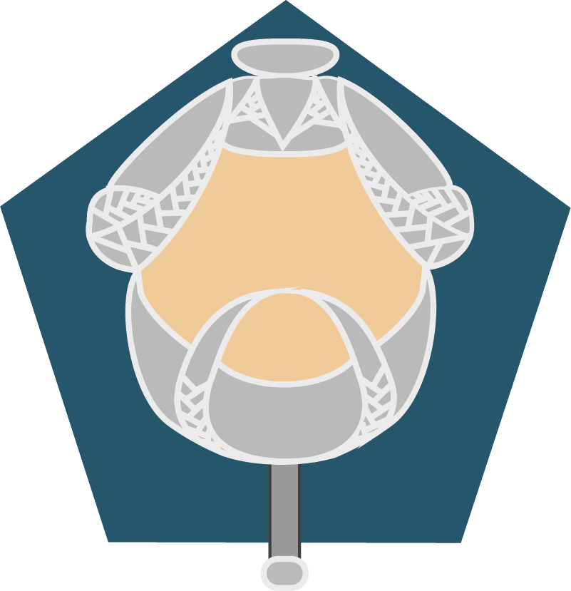
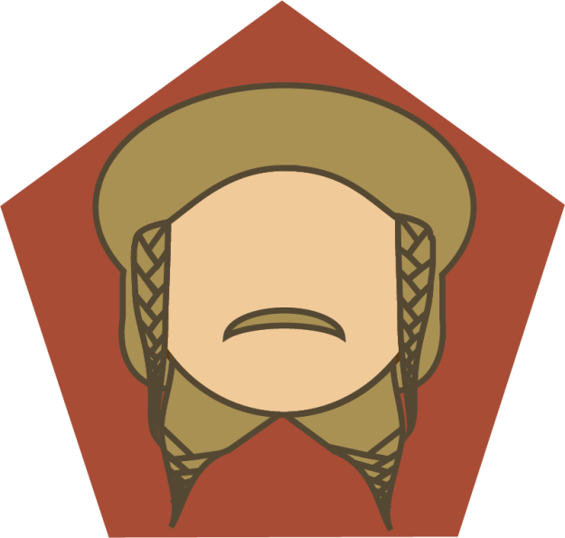
I decided to try my hand at fan art and create some character icons. I chose to use some members of the dwarven company from The Hobbit. Specifically Nori, Dori, Ori, and Bombur. The guys I circled in this photo.

First Draft

I am a HUGE fan of anything Tolkien and Middle Earth and I thought these four characters would be so much fun to illustrate. This was my first draft. All of this was accomplished using the pen and shape builder tools.

I didn’t receive very much feedback from my classmates. The only suggestion made was that Ori’s head looked pretty wide compared to the others. I also got feedback from my sister. She said that Bombur needed a double chin if I wanted to make a true character representation. All the other changes I made were based on feedback given to my classmates’ projects. I noticed that a lot of people were saying that icons needed uniform backgrounds. I originally had solid jewel toned background colors. The only thing uniform about them were the fact that they were jewel tones. I decided to use a geometric shape to bring more unity as well as add more representation of dwarven culture which uses geometric shapes in its decor. I also switch the background colors of Dori and Nori. I felt Dori’s light hair would go better with a darker background. Nori’s haircolor also went better with a lighter background color.

Final Draft

This is the final result!

While each character is unique, these icons work together as a set because of my illustration style. A simple character representation made of solid shapes, colors, and bold lines. All brought together with a familiar background. I very much enjoyed this assignment and am so excited to have gained a new art skill. If you would like to look at each icon in greater detail, keep on scrolling! If you have any comments or would like to provide a critique, please do! I am always looking to improve.


Magazine Spread Draft

I had the opportunity to learn about making a spread. I really enjoyed learning how to use Adobe InDesign. I am really happy with how my draft turned out. I wonder what changes I will need to make for the final product. All pictures are my own, as well as the front cover illustration.

The original article can be found here.

My draft will be here.

Photography Reverse Engineer

Key Techniques for Taking Great Pictures

Taking a good picture can be very daunting. We know that it takes great skill and years of practice to create professional grade photos. However, these three tips can help anyone at any skill level greatly improve their photography with any device.

Rule of Thirds

The rule of thirds is a tool widely used in the art community. In photography it means that the whole composition of your picture lines up with a nine square grid. Professional photographers may be able to use their judgment, but those of us who only know how to point and click need some sort of guide. It’s a good thing that most camera capable devices come with a setting that allows a nine square grid to pop on the screen.
In this photo of the New York skyline, taken by Anthony Nicholas, the rule of thirds is applied in a couple of ways. I have the nine square grid outlined in red. The first example is the position of the tallest building. As a focal point in the piece, it is lined up with the right grid-line. Second, the colors of the sunset and water reflection break up the photo into thirds. The cool blue sky I have highlighted in purple, the brightness of the sun peeking behind the buildings and reflecting in the water highlighted in yellow, and finally the darkness of the water in brown.

Here is my attempt at using the rule of thirds with my digital camera. I have the flower centered in two thirds of the picture and the center of the flower lined up with the left grid-line.


Leading Lines

Leading lines are used to draw your eyes across the photo. In a way it creates movement as well as highlight the subject or focal point. In this photo of the Scripps Pier by John H. Moore, He uses the alignment of the dock, ocean, and support beams to guide your eyes to the center. Here we see the subject, which is the setting sun perfectly aligned with the opening at the end. Each of the leading lines I highlighted in red with the subject circled in green.

My attempt at using the natural lines of this flower to guide the eye to its unique stamen. I have also applied the rule of thirds in positioning the flower.

Depth of Field

The point of photography is to capture experiences and places. How do we properly illustrate a 3D world in a 2D photo? Depth of Field is used to bring dimension to a flat picture. The background, middle ground, and foreground of the composition need to be clearly displayed. Usually, any one of the three will be in focus while the other two are blurred. Daniela Bowker uses the focusing tool of her camera to show the length of the rail of a railroad. While this is a simple photo, you can clearly see the small details of the railroad without losing sight of its depth. In this case, the subject is in the middleground, which I have labeled and highlighted in yellow.

Here is my attempt at using depth of field in a macro shot. I have the flowers focused in the foreground labeled and highlighted in blue.

So Easy, A Cell Phone Can Do It

All of my personal attempts were using a regular seven year old digital camera. Nothing fancy at all. Each of these professional tips can be applied to any device. Cell phones these days are so much better than my camera. They are more than capable of helping you achieve professional looking photos. I challenge you to go out and try each of these basic techniques yourself.

Typography Reverse Engineer

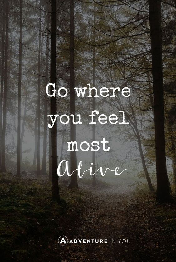
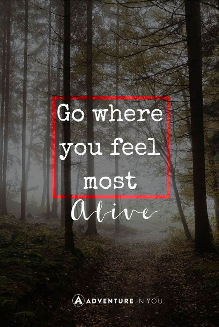
I found this gorgeous image  on an online travel resource site called Adventure In You.  Ana Faustino, wrote an article with a list of quotes that are meant to inspire adventure in the hearts of her readers. While there were many great quotes, this one was my absolute favorite. I found the whole design to be very appealing in the simplicity of the quote and in the contrast of the fonts used. Here I will break down the typography and explain its importance in design.

typoreveng

Contrasting Fontstyporeveng3.jpg

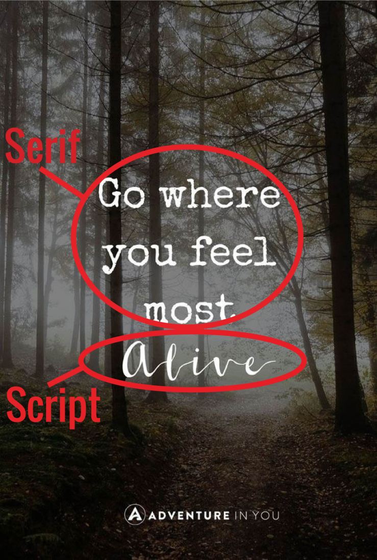
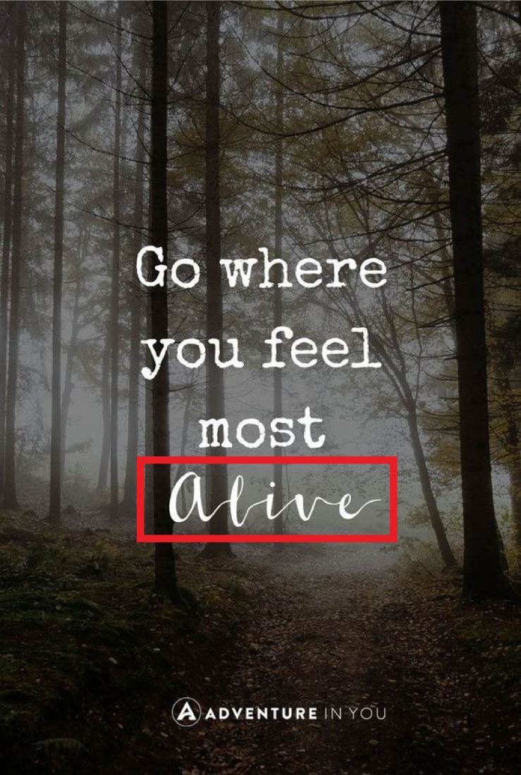
There are two distinct fonts being used in this graphic.  The contrast between the two is what brings the eye through the quote and clearly displays the emphasis on the most important word in the text. “Alive” is the word set apart from the rest in a beautiful script, compared to everything else being in a grungy serif. A simple typeface is best used in the bulk of a text. Only use a decorative and contrasting font to highlight key words.

Slab Seriftyporeveng1.jpg

The bulk of the quote it in a serif typeface, meaning it has little decorative feet projecting from each letter. As a slab, it has little to no thick/thin transitions in the stroke of the letter. This particular font is reminiscent of an old typewriter’s print. It plays into the roughness of the outdoors with its rugged look.

Script

typoreveng2.jpg

I love how the word ‘Alive’ is highlighted by a script typeface. It really emphasizes the beauty of the freedom that outdoor activities provide. Exactly what that word implies on its own. Scripts are meant to appear handwritten and in this case with ink. This contrasts with the stamped style of the first typeface. The thick/thin transition in the strokes of each letter as well as the connecting strokes provides the look of a steady flow of ink but also the natural state of free-handed styling.

Beautiful, Short, and Sweet

The style of this graphic is perfect for the message being sent. The meaning is displayed in more than just the words. A good design also conveys meaning with typography. Much like the brush strokes of a painting. The rugged nature of the outdoors and the freedom of adventure is clearly demonstrated in each typeface. Combined with the woodsy background and the quote itself, the image makes for a very convincing ad for outdoorsmanship.  Overall, it’s the simplicity of the piece that has inspired me to take a step outside. A short quote and only two contrasting fonts can be all that’s needed for a good typographic design.